I’m obsessed with typefaces and fonts .1
My programming productivity is irrationally dependent on the font I pick for my IDE. I have spent unhealthy amounts of time experimenting and trying different fonts for programming.
I usually prefer a monospaced font and I’ve bounced between Inconsolata and Consolas in the past – both truly beautiful typefaces.
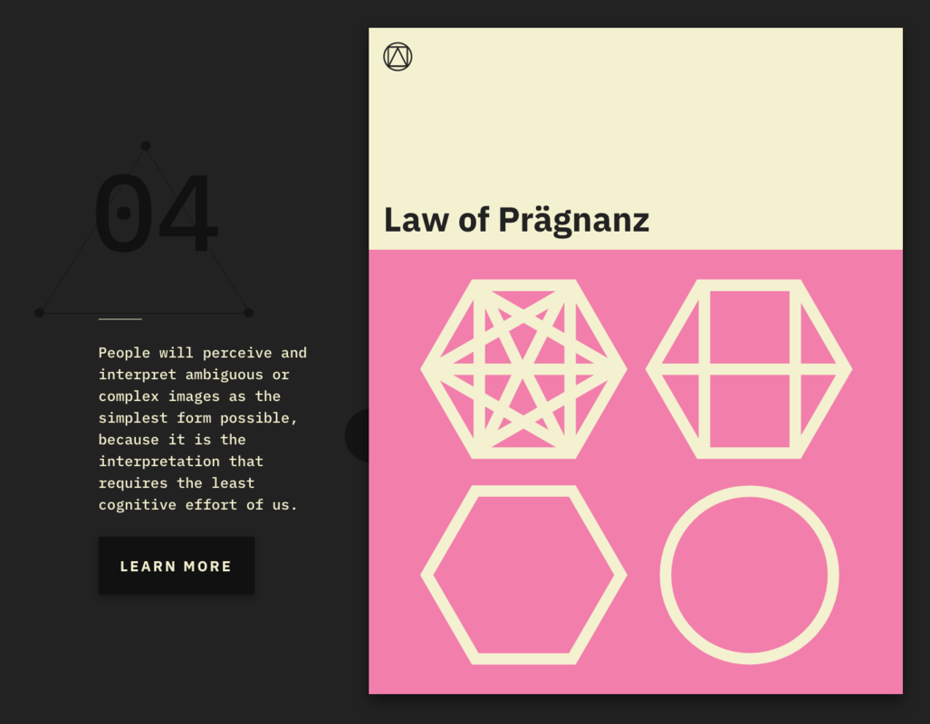
Recently though, a design director at Instacart shared this link on the laws of UX (a fantastic read btw).
But — hot damn — I was smitten after looking at that website. The font used there was GORGEOUS! I knew it was monospaced just from looking at it. I didn’t get past the first law, without first finding out which font was being used.

Thus I stumbled upon my new programming font – IBM Plex Mono. I don’t make a font change in my IDE that casually, without first putting it through the paces.
I give it a glowing recommendation for your IDE. There’s an interesting back story behind the making of the font on Medium too.
Btw, just changing the font is not enough – you have to pick the right size and line spacing (I’ve found a size of 15 and line-spacing of 1.15 works best for me).
Download IBM Plex Mono absolutely for free.
Did you know – fonts and typefaces aren’t necessarily interchangeable. You use “typeface” when you’d use “song” (e.g. “I love that song/typeface …”), and “font” when you’d use “track” ("… so I’m going to buy the track/font for it"). ↩︎